ISC 2020 Analysis: An application of Data Science and Statistics
The ISC Exam results were released on 10th June, 3 PM IST. In this article, I’ll be analyzing the results of the 117 students in the science stream of my school and showing how they performed. I’ll also weave a story with the data and point out things that could have been improved, which would be helpful for future students.
Index:
- Elementary inferences: How have people fared overall?
- Frequency Distribution of Marks: How many people got the same marks in a subject?
- Quartiles: What score is comparatively a good score?
- Corellation Analysis: Is there a relation between marks scored in different subjects?
- Using other datapoints: Do girls perform better than boys? Are back-benchers doing poorly?
- Conclusion
Elementary Inferences
The Science Stream consists of 117 Students, with 80 boys and 37 girls, all of whom passed.
$$\begin{array}{|c|c|} \hline \text{Dataset} & \text{mean} & \text{median} & \text{mode} & \text{max} & \text{min} & \sigma \\ \hline \text{Bo4%} & 83.11 & 84.75 & - & 97.75 & 57.5 & 8.86 \\ \text{Overall %} & 80.32 & 82.6 & 85.8 & 97.6 & 52.6 & 10.10 \\ \text{Boys Bo4%} & 83.70 & 85.5 & 80.25 & 97.75 & 57.5 & 8.62 \\ \text{Boys overall %} & 80.94 & 82.70 & - & 97.6 & 52.6 & 9.61 \\ \text{Girls Bo4 %} & 81.84 & 81.25 & - & 95.25 & 59.5 & 9.34 \\ \text{Girls overall %} & 78.98 & 80.5 & - & 94.8 & 54.6 & 11.10 \\ \hline \end{array}$$
The mean, median and mode lie in the $80-85 %$ range for almost all datasets. There is a standard deviation of 8.86 from the mean and the toppers lie $1.5\sigma$ right of mean ($>96.4%$). Interestingly, the people who scored the least lie $3\sigma$ left of mean ($~56 %$), which is more than the toppers lie right of the mean. The Boys and Girls datasets are compared in more detail in Section 5: Using other datapoints
A similar raw data comparision can also be done with subjectwise marks: $$\begin{array}{|c|c|} \hline \text{Dataset} & n & \text{mean} & \text{median} & \text{max} & \text{min} & \sigma \\ \hline \text{English} & 117 & 87.54 & 88 & 96 & 70 & 4.46 \\ \text{Physics} & 117 & 78.75 & 81 & 100 & 45 & 13.94 \\ \text{Chemistry} & 116 & 72.49 & 71.50 & 98 & 42 & 13.65 \\ \text{Mathematics} & 107 & 73.98 & 77 & 100 & 16 & 19.32 \\ \text{Computer Science} & 80 & 88.85 & 91 & 100 & 54 & 8.20 \\ \text{Biology} & 28 & 89.14 & 90 & 97 & 75 & 5.35 \\ \text{Environmental Science} & 7 & 80.71 & 78 & 94 & 72 & 6.85 \\ \text{Art} & 4 & 88.25 & 88 & 91 & 86 & 2.22 \\ \hline \end{array}$$
This is an interesting dataset; looking at it, a few stories are evident:
- Low Standard deviation in English and Computer Science: This is an interesting theme. English, given it’s size, has the lowest standard deviation of $4.46$. Computer Science has a remarkably high mean of $88.85$ and a median of $91$.
Most students in class do not go to external tuitions for these subjects(see edit). This means that the quality of education imparted in the class room is quite good and brings results for English and Computer Science.
EDIT: Turns out that quite a few people who have taken Computer Science and scored above 90 went for tuitions. A Majority of students don’t go to tuitions for English, though, and I believe that our school has an above-average showing in English this time. (reference)
- High standard deviation and low mean in Physics, Chemistry and Mathematics: Another very interesting (and scary) theme: these subjects make up the core of science and it is shocking to see students perform badly in these core subjects. Most students seek external help for these subjects, and in spite of the external help, are not able to perform well. The mean marks in Math are 74, while they should ideally be close to 90, due to the precise nature of the subject. The education system needs to have a serious rethink on where they are going wrong in imparting the knowledge of these core subjects to the students.
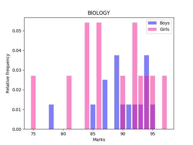
In the following sections, I won’t be focusing too much on Arts, EVS and Biology: Arts and EVS make up a very small dataset, whose results may not be reliable. The marks obtained in Biology are not representative of the students’ potential: due to the exams being cancelled, the marks for Biology were derived via this averaging algorithm.
Frequency Distribution of Marks
I’ll be plotting a few Histograms in this section and doing an overview of the ‘spread’ of marks across the spectrum. This helps visualize the data presented in the previous section. The data for most subjects fits into a bell curve, with the exception of Physics, Chemistry and Mathematics
As a small primer: A histogram plots the frequency of a particular element in a data set. If 5 people scored 95 marks, then a bar 5 units tall would be placed at the 95th element. The graphs would make this clearer.
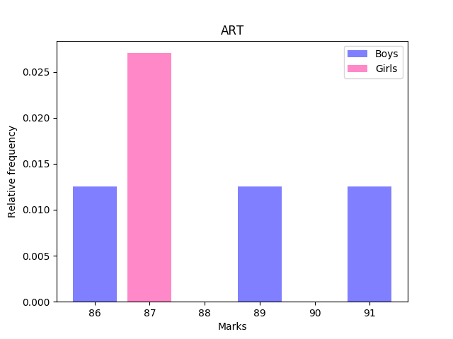
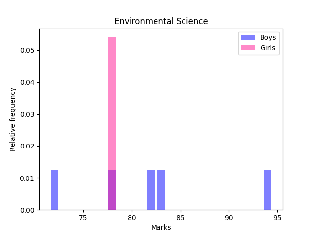
Let’s start with the small subjects: Arts, EVS and Biology
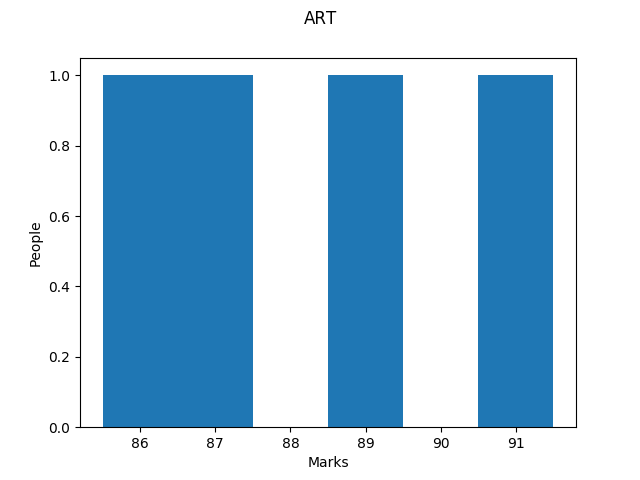
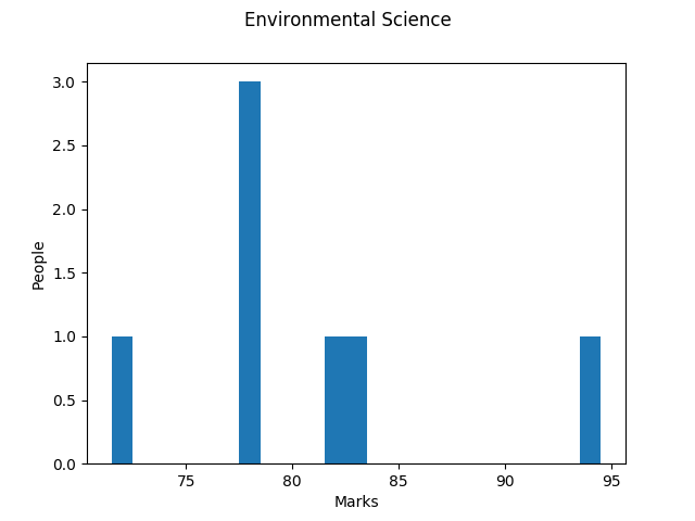
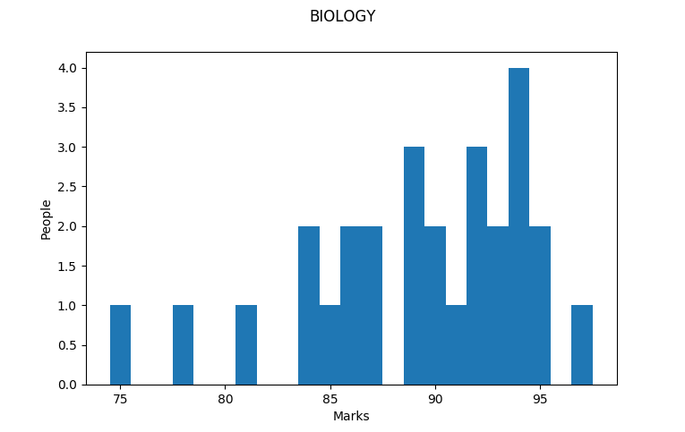
There’s not too much to see here, because of the sparsity of these graphs. Let’s move on to English:
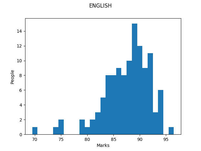
The graph for English nicely highlights the bell curve distribution; a majority of people have scored 89, and almost all students have obtained marks in the $79-94$ range. Computer Science also shows a similar trend
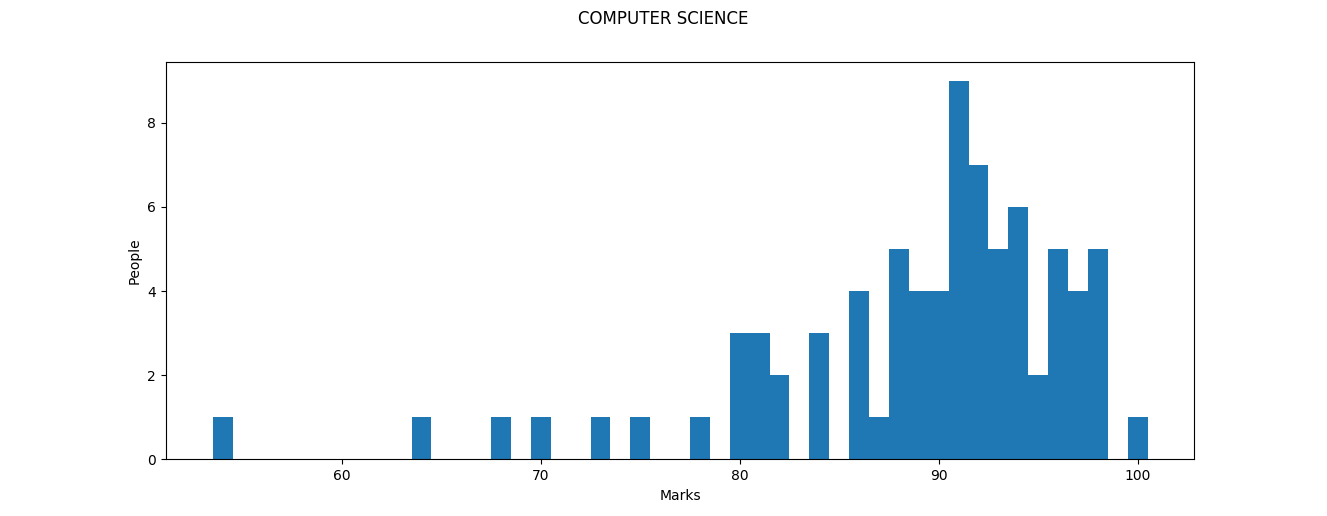
Apart from a few outliers on the lower end of the spectrum, most people have obtained above $85$ here, with 91 being the most common score. 17 people obtained a score of 95 and above. One person obtained a solid $100$. This is a good result in a not-so-easy subject.
Moving on to Physics:
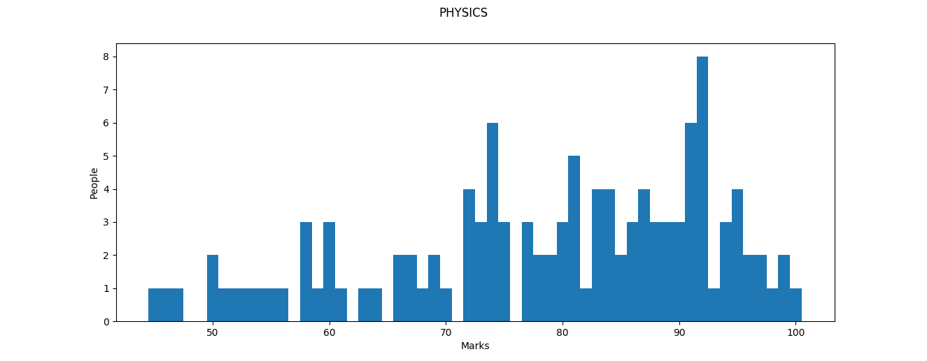
The Median for Physics was much higher than that of Maths and Chemistry (In part maybe because the paper was easy). We see that around 29 people have scored less than 70 here. 92 is the mode for this dataset, which is a good score. Again, one person has scored $100$, which is not an impossible feat in any of the sciences.
What immediately pops out in the Physics graph is that there is no well-defined ‘peak’ or ‘cluster’ in the data as there was for the previous subjects. This becomes even more apparent in Chemistry:
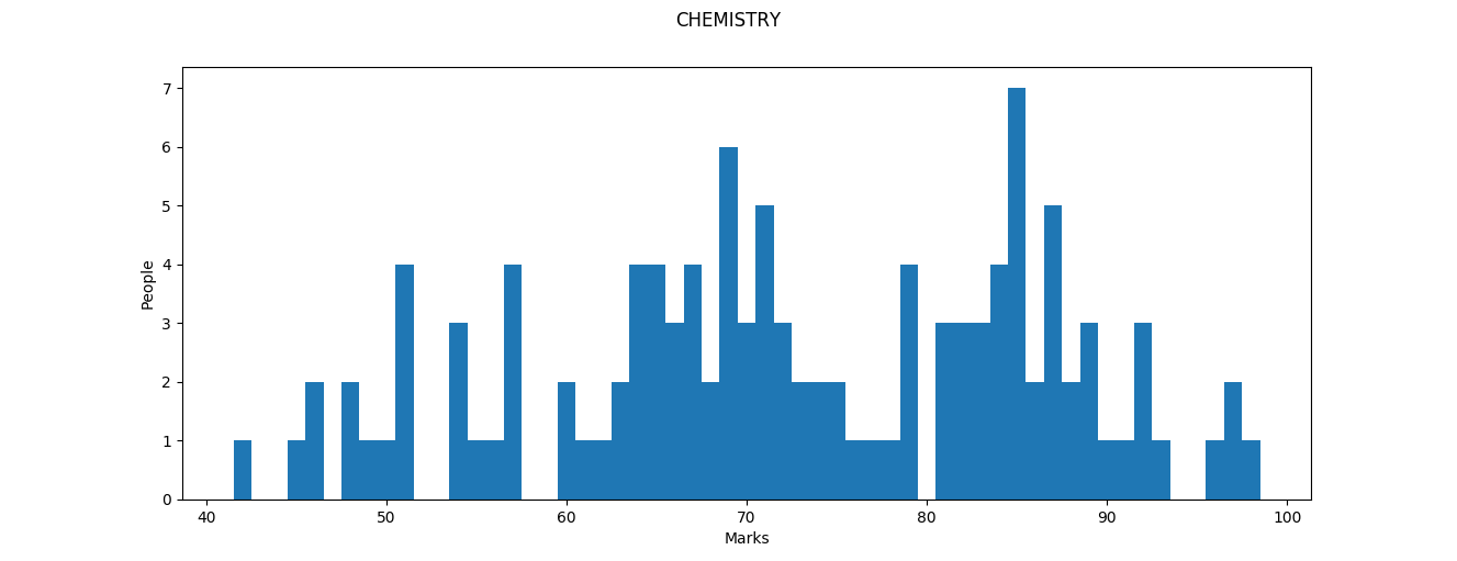
Mark segmentation is heavily apparent in chemistry, with four clearly defined segments: those scoring above 95, those in the 80-95 range, those in the 60-80 range and those who obtained below 60. The segmentation explains the high standard deviation as well as the low mean (a large number of people are centered around 70 and 85). The number of people scoring above 90 drops heavily here, with only 10 people crossing the barrier. Amazingly, nobody obtained a 100 or a 99 in this paper, with 98 being the highest.
Finally, Maths teaches us a lot of lessons:
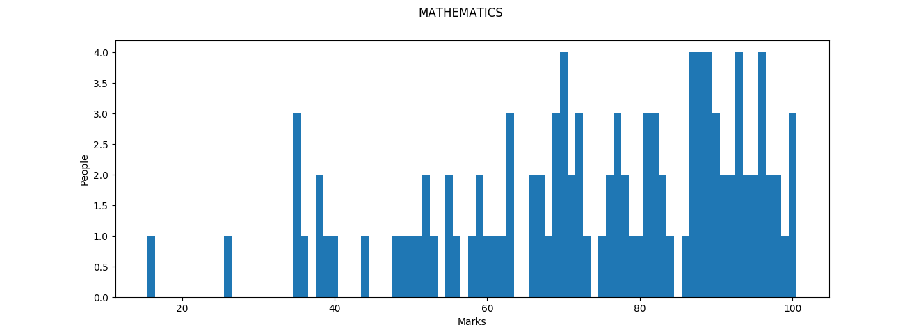
Marks in math resemble a bag of dropped marbles: there seems to be a slight pattern here, but one that is heavily tinged by apparent randomness. Heavy segmentation and sparse distribution show why the standard deviation is around 20 here. Inequality is also highly apparent here: those who do well at maths do exceptionally well (3 people scored a 100) and those who do poorly do extremely poorly. Part of this is due to the high-stakes nature of the math paper: the marking pattern has a tendency to be ruthless here, while the other part boils down to imparting math education to the people who don’t have a knack for math. There are two lessons here: for the people who are yet to give their exams, Study math and Study math hard. For those who have already given their exams, If you have done poorly in Math, take comfort in the fact that you are not alone. Math (and Chemistry) was tricky this time and if you are taking a math-heavy field, you will have several opportunities in life to do better in this subject later.
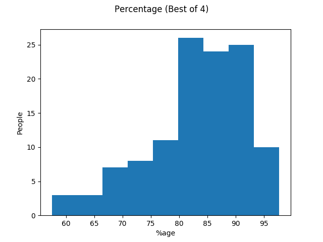
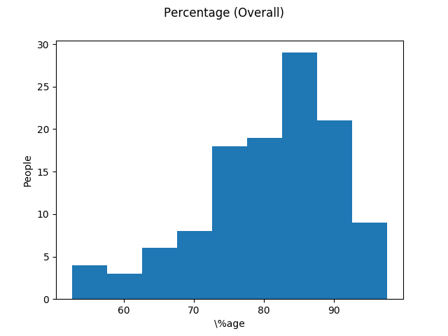
Finally, Here’s the histograms for Best of 4 percentage and Overall percentage:
Quartiles
What score is a good score? The same set of marks, when viewed by different people, can have different interpretations. While your parents may think you have done poorly, compared to your friends, you may have done pretty well! Quartiles take care of this: they convert your percentage to percentile (A concept we’re all familiar with, after JEE Main) and tell you into which ‘bucket’ you fit:
- 1st quartile or Lower quartile: below 25th percentile
- 2nd quartile: between 25th-50th percentile
- 3rd quartile: between 50th-75th percentile
- 4th quartile or Upper quartile: above 75th percentile This table shows the entry marks required to break into a particular quartile:
$$\begin{array}{|c|c|} \hline \text{Dataset} & \text{Q1} & \text{Q2} & \text{Q3} & \text{Q4}\\ \hline \text{Bo4%} & 0 & 78 & 84.75 & 89.75 \\ \text{Overall %} & 0 & 74.60 & 82.60 & 87.80 \\ \text{English} & 0 & 85 & 88 & 91 \\ \text{Physics} & 0 & 72 & 81 & 91 \\ \text{Chemistry} & 0 & 64 & 71.50 & 84.25 \\ \text{Mathematics} & 0 & 62.50 & 77 & 89.50 \\ \text{Computer Science} & 0 & 86 & 91 & 94 \\ \text{Biology} & 0 & 86 & 90 & 93.25 \\ \text{Environmental Science} & 0 & 78 & 78 & 82.50 \\ \text{Art} & 0 & 86.75 & 88 & 89.50 \\ \hline \end{array}$$
As an example, if you obtained a best of 4 percentage of $85%$, you would fit in the Third Quartile. This is because you broke through the first (0), second (78) and third (84.75) quartile entry limits but could not break into the fourth quartile (89.75). Hence, your quartile is detemined by the entry marks just below/equal to your own marks.
Corellation Analysis
Subjects are not disjoint sets: there is quite a bit of overlap between two subjects. As an example, Atomic Structure is a topic we study both in Physics and Chemistry. For a broader example, a firm understanding of Mathematics is required to do well in Physics and Physical Chemistry.
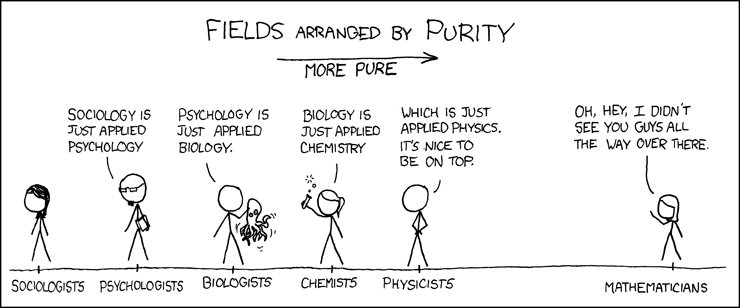
Obligatory XKCD :)
In this analysis, I’ll treat Mathematics as the ‘glue’ subject and analyze how Physics and Chemistry coreelate with Mathematics, as well as how Physics and Chemistry correlate with each other.
First up, Mathematics-Physics and Mathematics-Chemistry corellations:

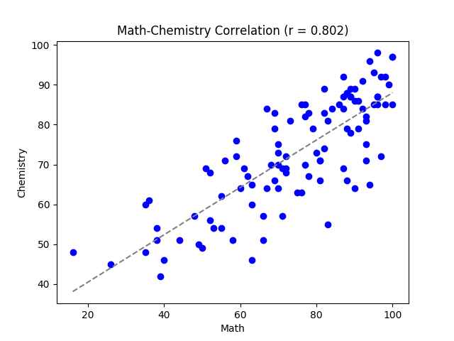
Notice that $r > 0.8$ for both of these correlations: this means that those who did well in math automatically did well in Physics and Chemistry, which reiterates a key point to upcoming students: learn to love Math. Also notice that $r_{MP} > r_{MC}$. This also validates the fact that Maths is more important for Physics than it is for Chemistry (which is kind of obvious, since Physical chemistry has around 30-40% weightage only).
Physics-Chemistry yields an interesting graph:

Amazingly, there is an even higher degree of correlation here than there is between Math-Physics and Math-Chemistry. This stumped me. If any of the readers have an idea as to why Physics and Chemistry are so interlinked (only the 12th syllabus), then feel free to drop a comment down below. The only theory I have for now is that there are 9 students who have not taken math but have taken Physics and Chemistry (or a similar permutation). These 9 extra data points are contributing the extra $0.04$ to the correlation coefficient.
Using Other Datapoints
Remember this table from the first section?
$$\begin{array}{|c|c|} \hline \text{Dataset} & \text{mean} & \text{median} & \text{mode} & \text{max} & \text{min} & \sigma \\ \hline \text{Boys Bo4%} & 83.70 & 85.5 & 80.25 & 97.75 & 57.5 & 8.62 \\ \text{Boys overall %} & 80.94 & 82.70 & - & 97.6 & 52.6 & 9.61 \\ \text{Girls Bo4 %} & 81.84 & 81.25 & - & 95.25 & 59.5 & 9.34 \\ \text{Girls overall %} & 78.98 & 80.5 & - & 94.8 & 54.6 & 11.10 \\ \hline \end{array}$$
I’ll be expanding on this to display separate statistics for Boys and Girls in all the subjects. One problem that exists is that the number of boys and girls is not the same: not normalizing the data beforehand would favour the boys in every case. In these graphs, both the boys and girls are normalized, such that each boy or girl represents a fraction of the total boys and girls (for boys this fraction is $\frac{1}{80}$ as there are 80 boys, and for girls this fraction is $\frac{1}{37}$, as there are 37 girls
As we did previously, Let’s start with Art, EVS and Biology, three subjects from which there are minimal inferences to be drawn:
Not too many inferences to be drawn here: EVS and Art have a very small sample size and Biology was calculated based on averages. Let’s move on to English and Computer Science
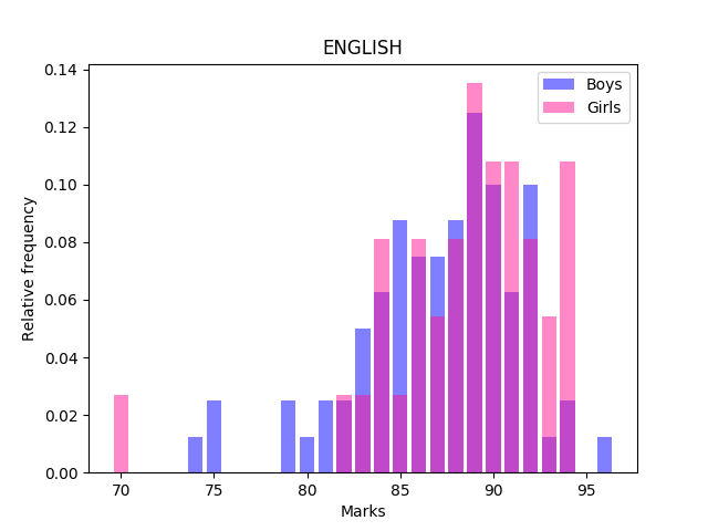

Girls and Boys are pretty much on par with each other in Computer Science, whereas for English, Girls do better than Boys.
The Sciences, however, have a different story to tell. Here’s Physics:
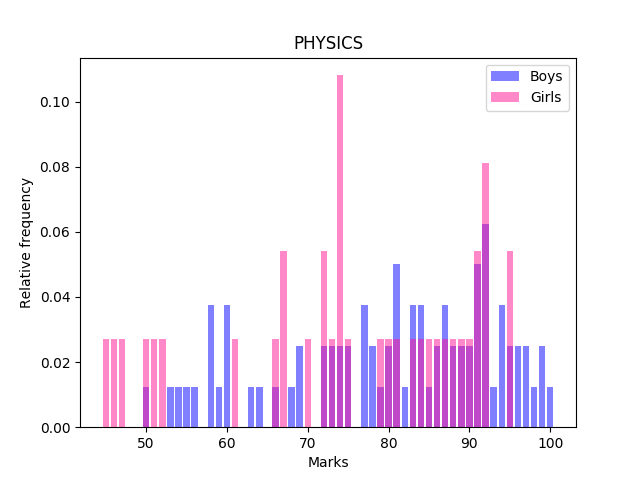
We clearly see that the boys are doing better than girls in Physics. A large number of girls have score in the $72-75$ mark range, as well as in the $46-53$ mark range. Girls lead boys in the $88-92$ mark range, however, the $95-100$ mark range is completely occupied by boys. Chemistry paints a similar picture:
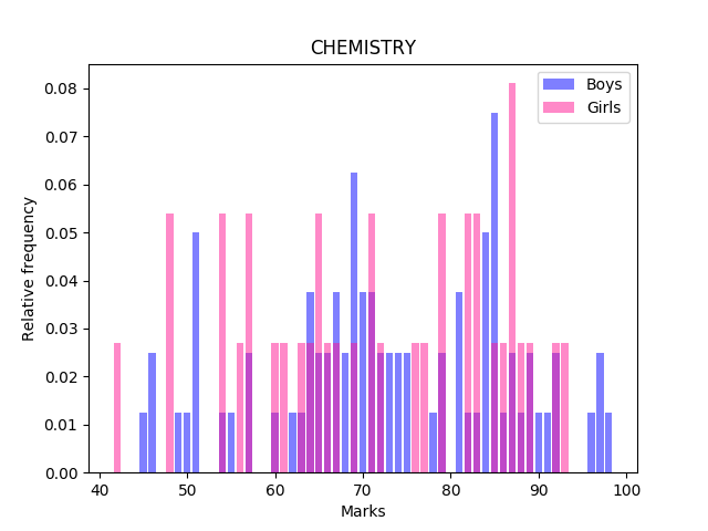
Again, the frequency of girls in the $<60$ mark range is high and the $95-100$ mark range is again occupied by boys. Girls do outperform boys in the $82-93$ mark range here.
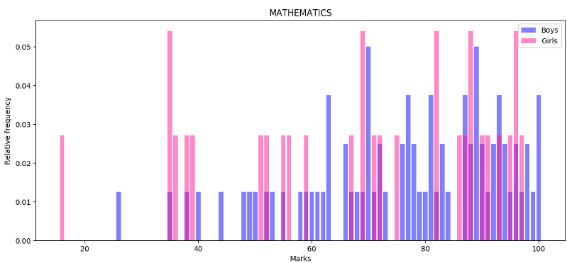
Mathematics too is similar. There are no girls in the $97-100$ range and an abundance of them in the $<40$ mark range.
Conclusion
This analysis is by no means exhaustive: many other stories can also be told with exactly the same data set. However, the most important lesson that stands out is to Focus on Math. I cannot stress this enough. Math is required for Physics, Chemistry and to a small extent, Computer Science as well. Having a firm grounding in math is essential for all science students. Math is also a ‘precise’ subject, which means that the probability of scoring better marks in Math is higher than it is ‘soft’ subjects such as English.
For the ones who have already given their papers, I hope that this analysis shows you how well you have done and also points out places where you could have improved. The real value of this analysis lies for the students who are yet to give their papers. I would have benefited immensely had such an analysis been available for me to read before my exams. I hope that upcoming students can use this wisdom to shape their own preparation strategy for the exams.
Behind the scenes
The data was analysed with Python. Matplotlib was used for drawing the beautiful graphs and numpy, along with python’s inbuilt statistics library was used for doing the calculations. This is the first time I’ve ventured into data science, and I’m really enjoying it :) R was a candidate for doing most of this processing (I really like R’s ggplot2 library: it’s built on solid concepts), but I already had my python development environment set up on my machine and wanted to do this in a language I’m comfortable with.
Further reading (for those interested in Data Science):
- Towards Data Science - Amazing medium blog on Data Science
- R Project - R, a language for statistical computing and graphics
- Statistics How to - For absolute beginners in statistics